
Design Brief
As a UX Design student at General Assembly, I was tasked with applying my UX skills to an existing product as part of a UX team. My team was responsible for creating a schedule, conducting user and business research, overall information architecture and content strategy, as well as deliverables (wireframes, desktop and mobile prototypes, and presentation).
Time
Role
-
3 Weeks
-
UX Researcher
-
UX Designer
-
UX Strategist
-
Project Manager
Tools
-
Figma
-
Whimsical
-
Zoom
Team Members
-
Claudine Limtingco
-
Abel Rondon
-
Lilliya Sultangaliyeva

We had 3 weeks for this project, with our design cycle consisting of an iterative process focusing on research and ideation. We mostly focused on research which took us 2 and a half weeks as we went back and forth to really have a good understanding of the problem space and the needs and pain points of our target users.
Introducing Indeed

We wanted to focus on the job market problem space because Covid-19 has caused unemployment to skyrocket. Many people now face the job search experience and companies are inundated with applications from job seekers.
Surveys
Surveyed 29 job seekers
To understand more about the job search experience and see how it could be improved, we conducted surveys.
We found that Indeed took the top spot as the most used Job search site.
These results led us to focus on Indeed as the company and brand we wanted to tackle for improvement.

Job Seeker Interviews
Interviewed 5 job seekers
We conducted interviews to get more qualitative data and gain a more in-depth understanding of their job-seeking experience.
Our Key insights:
Values transparency and detailed job posts
Struggled to quickly read through job posts
Disliked the lack of organized structure on the job postings
Meet Jo Hunter

Jo's User Journey


First, Jo starts her job search on the Indeed homepage. She is feeling nervous but hopeful.

She searches for a job and scans the first few job description titles to see which ones seem like a potential fit for her.
She selects a job post and tries to get the main points to understand if she qualifies. Sadly, she’s not a match this time, so she continues to look for the next one.

Jo clicks on the next job post, expecting information to be laid out the same as the last one, however the job listing looks different and inconsistent. Annoyed and confused, Jo thinks “this process could be much faster”.
.png)

She looks at another job post but begins to feel demotivated. The job details are one giant clump of information.
Jo thinks to herself “Uhhh this isn’t that clear, but I think I qualify?? Whatever, I’ll just submit a resume and see what happens.” and goes to apply for the job feeling unsure.
*Hover over sections for more details
After going through Jo’s unhappy journey we thought to ourselves, how might we help improve the job search experience for Jo, so that she can successfully find and apply to jobs that she’s a good fit for?
We realized that in order to address these issues, we needed to understand how the job posts were created in the first place, as it seems to be at the core of Jo’s struggles. And we also wanted to know if the layout of the job description is something that Indeed has influence over.
Problem Space
We went through Indeed’s job posting process and discovered:
-
Indeed has an 8-page long flow.
-
All job information is entered into one box.
-
Indeed has a "deal-breaker" feature that can help filter out unqualified applicants
*Current Job posting Flow
Ultimately, how the job description is organized is up to the job poster with limited influence from Indeed.
By tackling how Indeed’s current job posting process is structured, we can affect how job seekers will see job listings.
Job Poster Interviews
We conducted another 5 interviews but this time with employers and recruiters to gain more understanding of their experience in job posting.
Key insights:
Received too many unqualified applicants
Found Indeed's Job Posting flow to be lengthy
Easily missed certain sections from Indeed's Job Post flow i.e deal breakers
Meet Alex Foster

Alex's User Journey


Alex opens up Indeed, excited to find new talent for his startup. He's confused at first when he struggles to find the employer section


Alex begins filling in job details. The number of options and checkboxes makes him feel overwhelmed.
He sees the employer assist and is interested but can't select 12 days even though it seems like an option. he feels frustrated

Alex is prompted to add more users, he dismisses the modal window. He’s starting to feel like the posting process is being dragged out

Finally Alex’s job is posted and he is directed to the Dashboard. He feels exhausted by the process.


Alex gets to preview his post. He’s excited and thinks to himself: “this must mean I’m almost done!”


He is asked to “sponsor” his job post. $25 is pre-populated and Alex doesn't see an option to reject the sponsor for a solid 2 minutes. He feels scammed!
25


Alex needs to validate his ID but can only do so using facebook. He only uses his facebook for personal use. Not having another option makes him more annoyed.
*Hover over each section for more details
Problem Statement
Revised problem statement based on user journeys:
"How might we make the job posting process easier and more intuitive for job posters like Alex, while also helping improve the job search experience for job seekers like Jo, so that she can successfully find and apply to roles that she’s a good fit for."
Initial Mockup
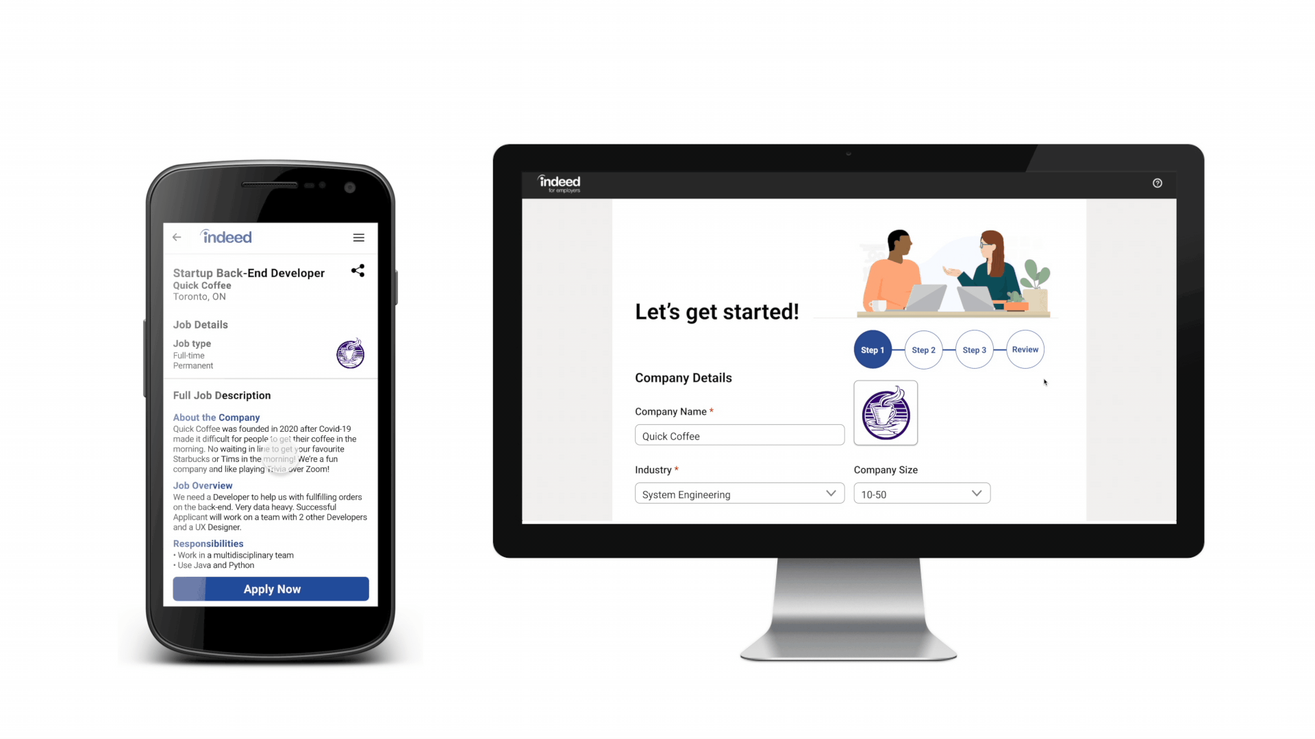
Since we had taken screenshots every step of the way, we imported the screenshots into Figma and cut down the sections and rearranged the components like puzzle pieces to change the flow of the form, making it more streamlined and intuitive.
In doing so, we were able to cut the job posting process from an 8-page flow down to 3 steps and a review page.


Features & Iterations
We conducted 3 rounds of usability tests and made changes based on feedback.
Organization
Updated formatting of job listings so that they are easier to read and consistent across the site.
This was done by breaking down the job description field into more specific sections.


Deal-Breakers
Separated the deal-breaker feature to make it more noticeable and easier to understand for job posters, to help them filter out unqualified applicants.


Verification
Added additional verification with Google in case the user doesn't have or doesn't want to use Facebook.


Learnings
-
Through this project, we really came together as a team. We created a schedule for our process, which really helped us improve our communication, time management skills, and helped us break complex tasks into steps.
-
We were also able to advance our research and prototyping skills by sharing tips and techniques with one another.
-
Lastly, we learned to compile our design specs for handoff to the development team using Zeplin